Stardock Software’s Start11 utility is shipping today as a 1.0 release, and if you hate the reductionist new design of the Windows 11 Start menu and taskbar, you’ll want to check it out. Start11, among other handy tricks, lets you move the taskbar around your desktop and configure the Start menu to emulate Windows 10’s look and feel.
Update: On Jan. 13, Stardock shipped Start11 1.1, whose most significant addition is the inclusion of folders, something that Windows 11’s own Start menu lacks. You can also add “fences” to the Start menu, Stardock says, with support for its Fences app. We haven’t tested these new features.
Start11, priced at $4.99 as a standalone utility, doesn’t offer everything: it can’t create any dynamic Windows 10 Live Tiles, for example, and your ability to move and resize the Windows 11’s taskbar icons is still somewhat limited. But if you’d like a more gentle transition between Windows 10 and Windows 11, Start11 certainly helps.
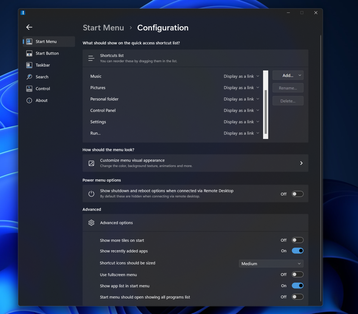
Start11 is the latest iteration of the “StartX” utilities from Stardock, which shipped similar Start8 and Start10 utilities as throwback UIs to earlier versions of the Windows operating system after Windows 8 and Windows 10 launched, respectively. Start11 simply installs over the top of Windows 11, presenting a more familiar way to interact with the operating system. The program itself consists of a straightforward settings menu, where you can tweak things as you’d like. After that, Start11 makes Windows 11 look as you please and then simply gets out of the way.

Mark Hachman / IDG
Tweaking your taskbar with Start11
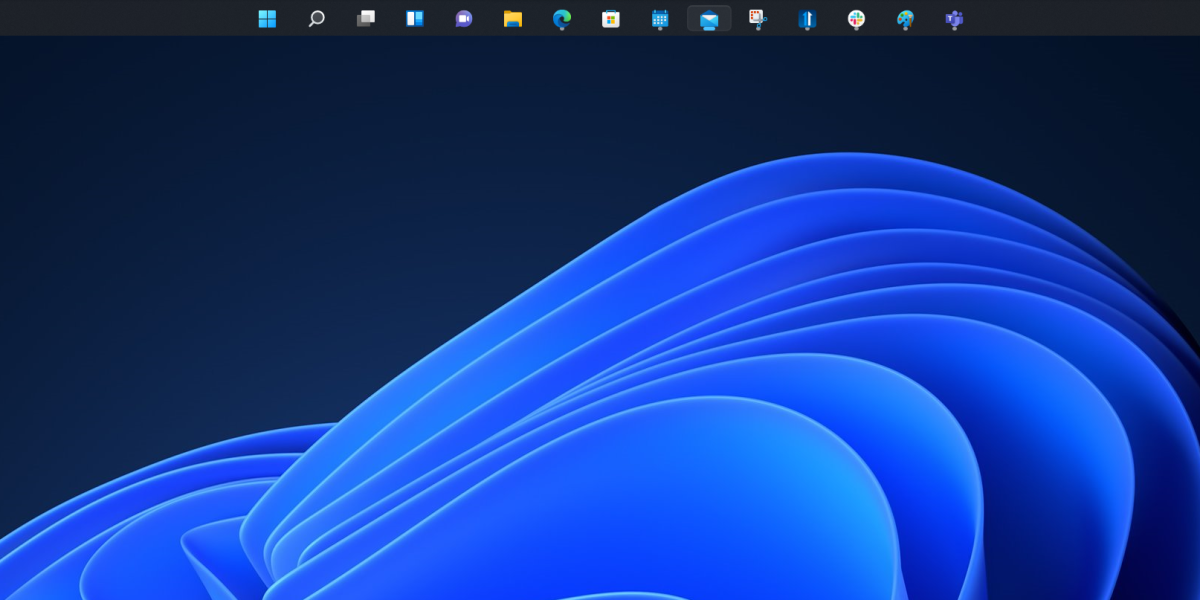
As our Windows 11 review highlighted, Windows 11 doesn’t let you to resize the taskbar or move it around your screen. Start11 does, though not with the full flexibility of Windows 10. Start11 allows you to move the taskbar to the top or bottom of the screen — not the sides — and resize the icons. (Doing so within the Start11 Settings menu requires you to click a button to manually restart the Windows Explorer process manually.)
You can tweak the location of the taskbar on each individual display, and resizing the icons certainly helps to maximize usable screen space on both tablet-sized and 4K displays. It’s a big improvement over the default Windows 11 experience. But Stardock has yet to fix a key annoyance of Windows 11 — the Windows system clock still only appears on a single display. Start11 also doesn’t yet allow you to resize the taskbar, nor drag and drop files on a taskbar icon to launch the application, though those limitations no doubt come from Microsoft more than Stardock.

Mark Hachman / IDG
Nevertheless, it’s a solid start, even if it’s not all that you might hope for quite yet. If it was, Stardock may have named it Taskbar11 instead.
Supercharging the Start menu with Start11
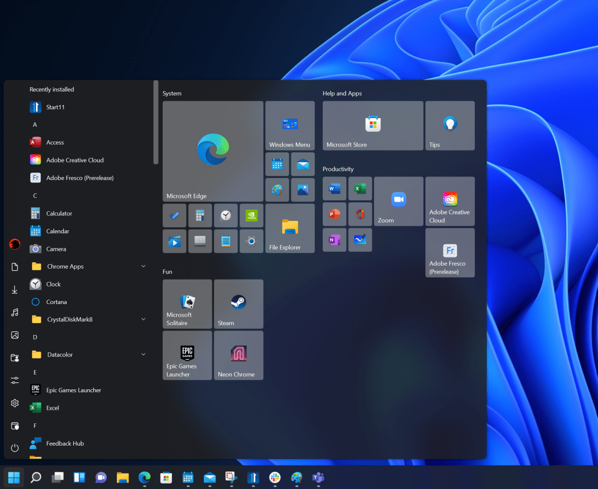
Windows 11’s Start menu is one of the more controversial aspects of Microsoft’s new operating system, but Start11 allows a number of tweaks to make it more familiar. You can use the Windows 11 Start menu if you’d like — but opt to let Start11 allow you to resize it or open it in a full-screen mode, which Windows 11 doesn’t yet do. Handy!

Mark Hachman / IDG
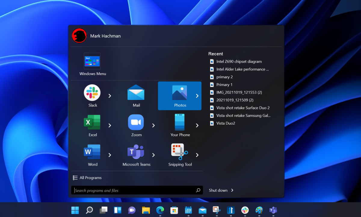
However, Start11 also lets you open Start as a Windows 7-like interface, or use the more tiled approach of Windows 10. In the latter environment, you can move and group icons, resize them, and generally make Start look like Windows 10, but without the animated “Live Tiles” that Windows 10 supported. Stardock also has its own “modern” style, which shrinks down the Start menu into an ultracompact layout, and points to your most recently-used files on an app-by-app basis, rather than the OS at large.

Mark Hachman / IDG
Start11 also provides some additional options for managing search, as well as some additional tweaks to launch Windows 11’s own Start menu versus Start11’s own. Still, if the operating systems’s native look and feel caused you to hold off on upgrading to Windows 11, Start11 indeed eases the transition.
This story was updated on January 13 with additional information.


