Expert's Rating
Pros
- Excellent design with an incredible display
- One UI is a major improvement over the Samsung Touchwiz Experience
- Performance and battery life is second to none
- Triple-camera system snaps great pics quickly
Cons
- In-display fingerprint sensor is a little finicky
- Hole in the display is an eyesore
- Samsung’s photo processing nowhere as good as Google’s
Our Verdict
The Galaxy S10+ might have a sky-high price tag, but it’s also a massive improvement over its predecessor, pushing the limits of conventional smartphone design just about as far as they can go.
Best Prices Today: Galaxy S10+
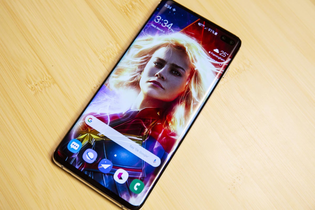
It’s something of a perfect coincidence that Samsung’s Galaxy S10+ goes on sale the same day Captain Marvel lands in theaters. Both were once the most powerful members of their respective universes. Both are struggling with an identity crisis spurred by a larger-than-life existential threat. And both have a gorgeous shimmer when the light hits them just right.
 Christopher Hebert/IDH
The Galaxy S10+’s fantastic display is in rarefied air.
And in many ways, they’re both the last of a dying breed. The Galaxy S10+ may represent the culmination of 10 years of Samsung’s Android engineering, but it’s also the phone that doesn’t fold. Much like last year’s iPhone 8 Plus, which existed in the shadow of the button-less and OLED iPhone X, the Galaxy S10+ no longer represents the pinnacle of Samsung innovation. That honor now falls to the Galaxy Fold arriving April 26. (In yet another curious coincidence, that date just so happens to be the same as Captain Marvel’s intergalactic turn in Avengers Endgame.)
But even with the forces of change closing in all sides, the Galaxy S10+ more than holds its own. It might have a sky-high price tag at $1,000, but the S10+ is also a massive improvement over its predecessor, pushing the limits of conventional smartphone design just about as far as they can go. And just like Carol Danvers, it’s not about to fade into irrelevance without a fight.
An upgrade to the classic design
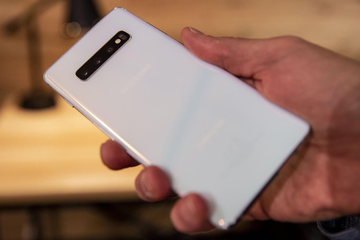
Even without straying too far from the Infinity Display formula that began with the S8, the Galaxy S10+ is a completely new device. Most notably, Samsung has trimmed its empty spaces even further, leaving slivers of black above and below the screen. That brings the size of the S10+ down to 157.6 x 74.1 x 7.8 mm, a touch smaller than the Note 9 despite sporting the same 6.4-inch display dimension.
 Christopher Hebert/IDG
The back of the S10+ comes in all-new prism colors that beautifully reflect and refract light.
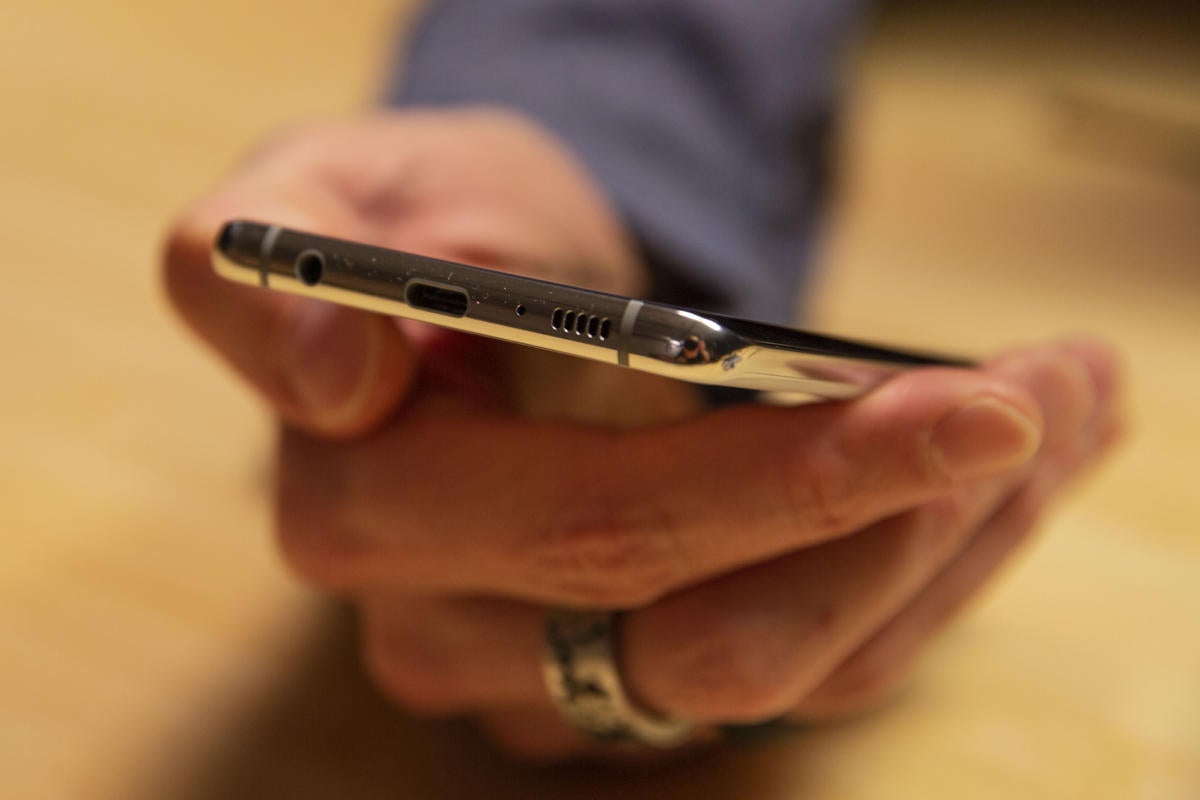
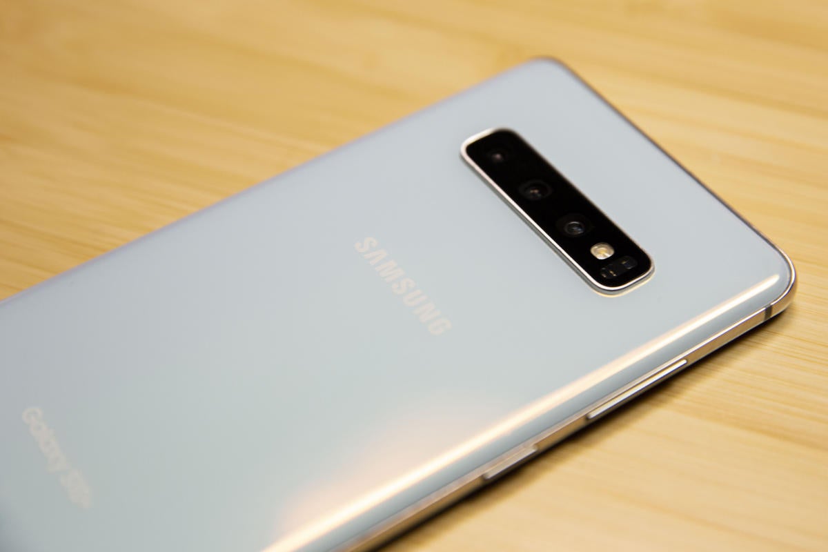
There’s not much to quibble with when it comes to the design. The return to chrome along the sides reflects a sophistication over the colorized aluminum of the S9, right down to the classic five-holed speaker grille along the bottom edge. The same chrome accent also lines the triple-camera array, which has been rotated to give your chosen color even more room to breathe. With so much glass, the S10+ tends to be a little slippery, but because Samsung’s new “prism” palette of iridescent hues is so gorgeous, you won’t want to cover it up. I suspect clear cases will be extra popular this time around.
The receiver has been pushed as high as it can go so it abuts the top edge rather than floating in the bezel, and as a result, it’s barely visible now. My only complaint is the power button, which is both shorter and higher than it is on the S9, making it that much more difficult to reach. The Bixby button is now in a much better spot, and it’ll get a lot more use this time, as Samsung is finally letting us remap it to launch an app or perform an action. And once again, the S10+ has a headphone jack, making it truly among the last of a dying breed.
No notch, but a hole in two
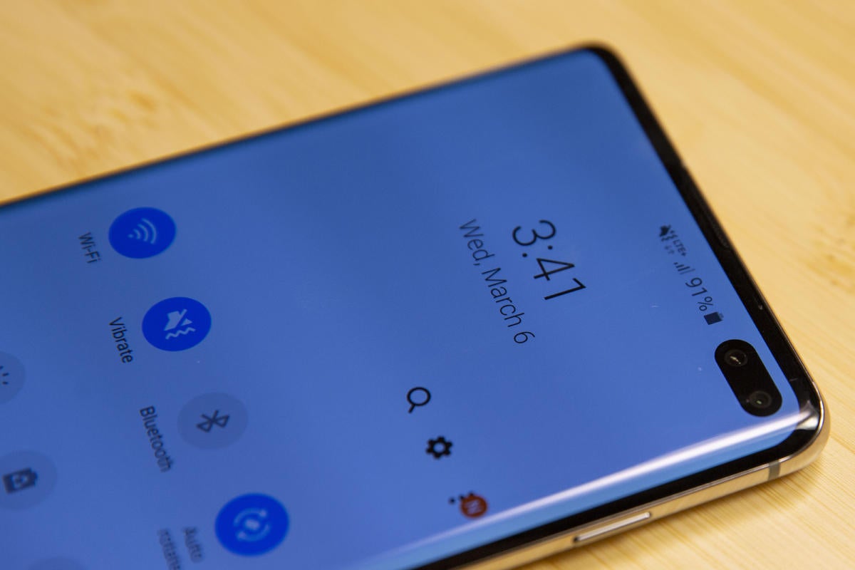
To achieve a near 90 percent screen-to-body ratio, Samsung had to push the front camera down into the display in the form of a hole in the right corner of the screen. Just like the controversial notches in its competitors’ screens, the hole in the Infinity O display wreaks havoc on the status bar, upsets full-screen images, and draws your eye in the worst way. Despite Samsung’s bold claim of “no notches, no distractions,” the hole is even more apparent on the S10+ because Samsung needed room for two front cameras.
 Christopher Hebert/IDG
The selfie cam on the Galaxy S10+ is an eyesore when it isn’t obscured by darkness.
This is why all of the stock wallpapers Samsung created for the S10+ have a clever bit of black in the corner to cover up the hole. It’s the same trickery Apple uses to cover up the notch on the iPhone XS, and it speaks to the inherent compromises of so-called all-screen phones.
I prefer a notch to the uncentered hole because I dislike the indented status bar, but neither of the solutions are very elegant. (Although some of the wallpapers available are pretty darn creative.) Maybe the future is in slide-out cameras or the complete elimination of the selfie cam like Chinese companies Xiaomi and Vivo are proposing. But for now, holes and notches are just a fact of life. And the S10+ will remind you of that every time you pick it up.
Easy on the eyes, frustrating to the fingers
Hole complaints aside, the display on the Galaxy S10+ is stunning. Samsung has always excelled at displays, but out of the box the colors have always been a bit too oversaturated for my tastes. Well, that’s not the case with the Dynamic AMOLED here. Samsung’s color gamut is clear, crisp, and remarkably bright without requiring any adjustments, and colors are realistic without looking too dull or muted.
 Christopher Hebert/IDG
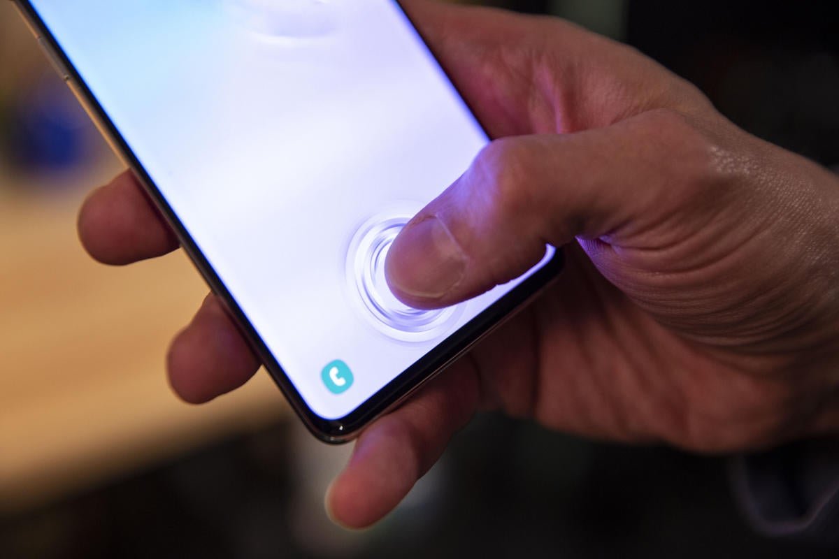
The S10+ has an ultrasonic fingerprint sensor built into the display, which has a cool animation when it’s working.
The display also hides one of the S10+’s new tricks: an ultrasonic fingerprint sensor, which uses sound waves rather than light to read the whirls and loops on your skin. Samsung’s fingerprint sensor has been a bone of contention ever since it moved to the rear of the phone precariously close to the cameras, and it’s no less of an issue here. In the age of Face ID and time-of-flight cameras, fingerprint scanning tech feels decidedly antiquated, and the hit-or-miss nature of the S10+’s sensor doesn’t help it feel any more modern, despite its under-the-glass hiding spot.
A mid-review biometric update improved the accuracy tenfold, but it’s still not an ideal solution for security or privacy in 2019. I wouldn’t necessarily call it a step backward from the S9’s physical scanner (which had its own placement issues), but it’s not much an improvement either (though I do like the ripple animation even if it is a millisecond slower).
What is a definite downgrade, however, is the loss of the iris scanner, leaving the fingerprint sensor as the only secure biometric option on the S10. That needs to change with the S11, and I hope the S10 5G’s time-of-flight sensor is a sign that 3D facial unlock is on the way.
Battery life makes a lasting impression
With the Snapdragon 855 processor and 8GB of RAM, the S10+ is every bit the beast it should be. Every benchmark I ran represented a significant jump over any 845 phone, and daily performance was stutter-, lag-, and slowdown-free. Here’s how it compared to the Note 9::
Geekbench 4 (Single-core/multi-core)
Galaxy Note 9: 2,294/7,714 Galaxy S10+: 3,448/10,803
PCMark Work 2.0
Galaxy Note 9: 8,227 Galaxy S10+: 9,549
3D Mark Sling Shot Extreme
Galaxy Note 9: 4,659 Galaxy S10+: 5,456
Of course, off-the-charts performance is basically table stakes for a $1,000 phone. Battery life is far more important. The S10+ packs a 4,100mAh battery, bigger than the ones in both the S9+ and the Note 9. The larger capacity makes a big difference. In benchmarks, I was able to top 11 hours of runtime, about 10 percent longer than with other 4,000mAh phones I’ve tested.
 Christopher Hebert/IDG
The five-hole speaker grille is a nice touch on the S10+.
In the real world, the S10+ is even better than the benchmarks indicate. Samsung’s new phones have Android 9’s new Adaptive power saving mode, which uses machine learning to intelligently shut off unnecessary apps and processes to conserve battery life. Switching it on makes the S10+ seem like it has a much larger battery than it does. I easily powered through a day of heavy use without needing to turn on the battery saver. A few percentage points might not seem like much, but over the course of a day it adds up.
And that extra battery life comes in handy when you want to use the Galaxy S10+’s coolest party trick: reverse wireless charging. It’s not the first phone to include the feature, but it’s the most mainstream one. Using it simple—just tap the Wireless PowerShare button in the quick settings, flip over your phone, and viola, it’s a charger—but it’s probably not something you’ll use much after your try it out or show it off to your iPhone-using friends. But it’s definitely the kind of thing that’ll be great to have on the rare occasion that you need it.
Finally, a worthy Galaxy interface
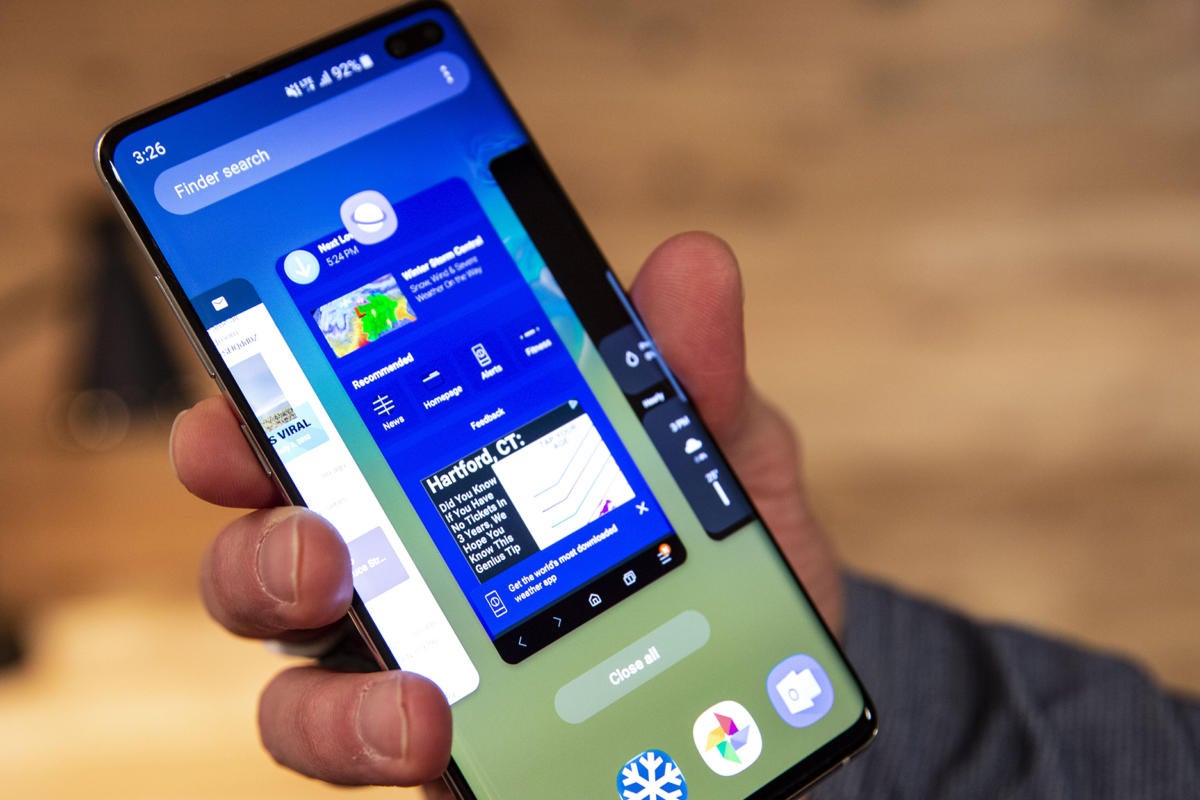
New Galaxy S phones traditionally usher in the latest version of the Samsung Experience, but Samsung actually first pushed its massive One UI overhaul to the older S9 this year. I’ve already written at length about what One UI means to Samsung’s family of devices, and on the S10 it truly feels like the software and hardware are finally in unison.
 Christopher Hebert/IDG
One UI on the S10+ is a vast improvement over the prior version.
The most obvious change is the switch from tap to gesture navigation, but Samsung isn’t quite ready to embrace it whole-heartedly. I was surprised to find that full-screen gestures were switched off by default when I powered on the S10, and without a prompt during setup, I wonder how many people are going to find its hiding spot inside the nav bar settings.
That’s a shame, because gesture navigation is nearly perfect on the S10+. With ultra-slim bezels, the swipes for back, home, and recent are natural and easy to reach. The extra few millimeters of space afforded by the elimination of the navigation bar gives the phone a real full-screen feel. I’d like to see Samsung experiment with more advanced gestures as One UI evolves, but the simple approach absolutely works. My only question is: Why’d we have to wait so long?
 Christopher Hebert/IDG
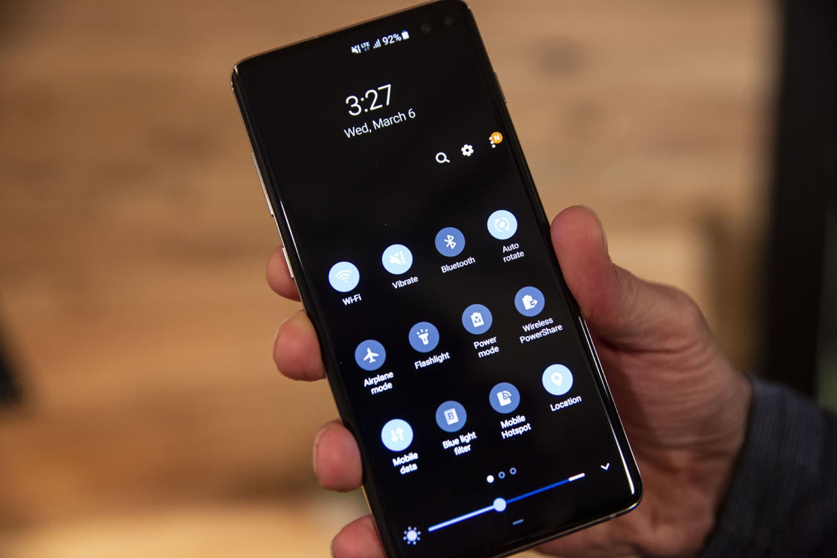
Night mode on the S10+ is gorgeous.
Night mode is also a standout on the S10+. Like a light switch for the S10+, Samsung’s Dynamic AMOLED display generates deep blacks that accentuate text and buttons even more than on the S9. The curved corners of boxes and windows perfectly reflect the S10+’s refined design, and the barely-there bezels make phone and the UI blend like never before. Even Bixby Home is better, with smarter card selections and engaging animations.
Speaking of Samsung’s digital assistant, Bixby has learned some new tricks on the S10 in the form of if-this-then-that-style commands. A powerful and useful system of shortcuts, Bixby Routines isn’t so much about voice commands as it is about intelligence. For example, you can set your S10 to conserve battery by turning off the always-on display if you forget to put it on the charger at night. Or you can limit auto-rotate to certain apps, such as YouTube and Netflix. Samsung provides a few routines to get started, but the combinations are basically endless, especially when compared to the relatively limited options with Google Assistant or Amazon Alexa.
A great camera gets better
Samsung has returned the S10 and S10+ to photo parity after making the dual lens an S9+ exclusive last year. Both phones gain the new triple-camera array that finally lets you capture ultra-wide images. Here are the specs:
- Camera 1: 12MP telephoto Camera, f/2.4, OIS
- Camera 2: 12MP wide-angle, dual f/1.5-f/2.4, OIS
- Camera 3: 16MP ultra wide, f/2.2
The result is a camera that can take different photos than the S9 does, though not necessarily better ones. That’s not so much a criticism as it is a recognition that the Galaxy S9+ already offers one of the best smartphone cameras you can buy, and Samsung is basically in refinement mode at this point.
 Christopher Hebert/IDG
The Galaxy S10+ has a triple camera array, but the pics it takes aren’t that much better than the S9’s single camera.
The biggest upgrade is in field of view. When switching to the ultra-wide camera (accessible via a button above the shutter), the viewing area increases dramatically, from 45 degrees to 77 degrees to 123 degrees. That means you’ll capture more of the scene without having to back up as much, as you can see in the comparison photos below, all taken from the same spot.
 Michael Simon/IDG
There’s a small bit of fisheye distortion at the edges of the frame in this image of Barcelona Cathedral when shooting in ultra-wide mode (right) and some exposure issues with the zoom lens (left), but it’s not enough to dissuade from using them.
The S10+ also performs great when capturing a range of colors, particularly when ample light is available. Images were consistently sharper, brighter, and more detailed when compared to the S9, and the S10+ even held its own against Google’s incredible processing engine on the Pixel 3. In the image of the candy below, the S10+’s auto white balance results in clearer definition and less saturated images, with less muddiness at the low end. When dealing with different shades of white, the S10+ wasn’t fooled into unnatural adjustments.
 Michael Simon/IDG
The S10+ (left) handles color exceptionally well, even besting the Pixel 3 in this rainbow of candy.
Nighttime and low light are a different story. While I was extremely impressed with the S10+’s ability to focus quickly in extremely low light, the pictures I snapped had far less detail than the ones I took with the Pixel 3. In some instances, it looked as though Samsung’s post-processing engine applied a smoothing filter rather than even trying to suss out finer details that were clearly visible with the Pixel 3. I’d love to see a Pixel-style Night Mode for Samsung phones at some point, maybe even later this year as part of the Note 9’s feature set.
 Michael Simon/IDG
If you look at the detail on the ceiling in this shot, the S10+ (left) is no match for the Pixel 3. Shoot, look at the ground as well!
Around the front, Samsung has augmented the standard 10MP f/1.9 lens with a second 8MP RGB depth camera with a slightly wider 90 FOV. If you take a lot of selfies you’ll appreciate the edge detailing and depth-of-field adjustments, but there’s nothing here that isn’t also available on the S10’s single front camera.
 Michael Simon/IDG
The Galaxy S10+ (left and center) takes excellent front camera shots with cool effects (center) as compared to the S9 (right). But the advantages of dual lens could have been greater.
I didn’t have a standard S10 to compare it to, but the S10+ definitely outperformed the S9’s front camera in basically every facet, as you can see above. However, as it stands the second front camera seems like a missed opportunity. I would have rather seen an ultra-wide second camera like on the Pixel 3 or a 3D camera for facial recognition.
Should you buy a Galaxy S10+?
There’s no denying that the Galaxy S10 is the absolute cream of the premium Android phone crop right now. It has the fastest processor, the most RAM, the most storage, and the best display money can buy. And it’s all wrapped in a beautiful package that’s hard to find much fault with.
 Christopher Hebert/IDG
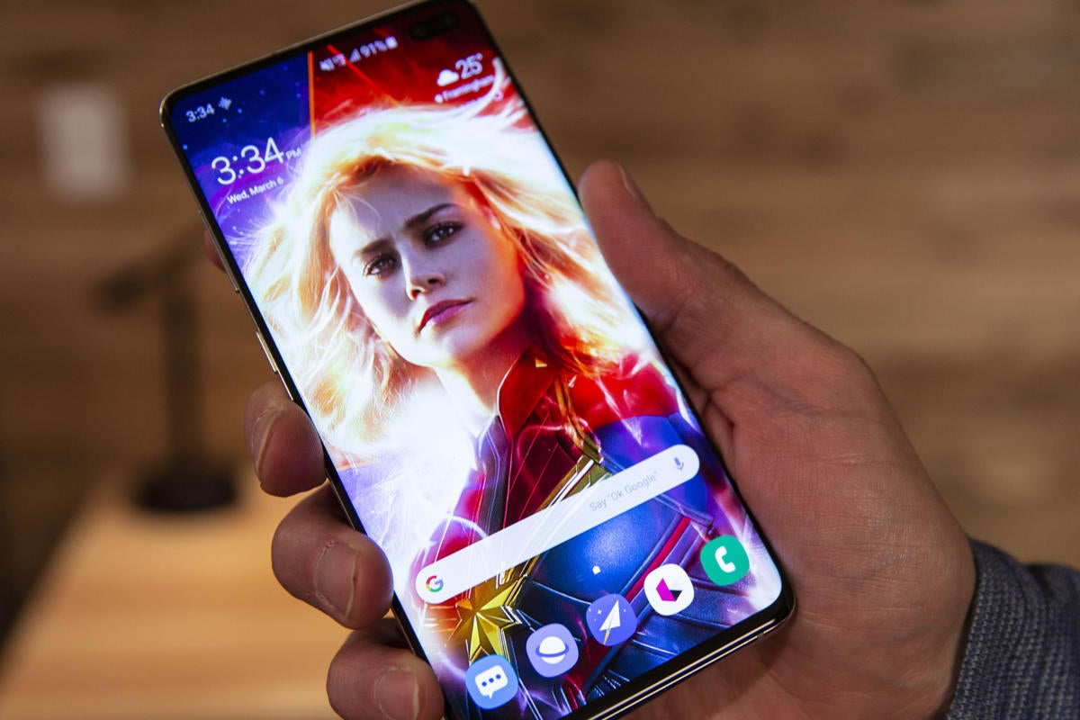
The Galaxy S10+ is a superhero of a handset even without any of 2019’s bells and whistles.
But there are definitely places where the S10+ falls short. The fingerprint sensor remains a point of contention, and it’s the phone’s only biometric security mechanism. The hole in the display for the front camera is inelegant. The cameras are less impressive than in Samsung’s past efforts—a point underscored by Google’s processing abilities in the Pixel 3.
Then there’s the elephant in the room, the Galaxy Fold. The S phone has enjoyed flagship status for the better part of a decade, but suddenly it needs to figure out where it fits in Samsung’s smartphone hierarchy, at least in terms of wow factor.
Still, even without the newest specs and features, the S10+ could very well still end up being Samsung’s mightiest hero. It might not deliver the sci-fi sizzle of the Galaxy Fold. But like Captain Marvel, sometimes old school is all you need to properly defend the Galaxy.
