 At a Glance
Expert's Rating
Pros
- The Infinity Display is even better than the one on the S8.
- Camera takes fantastic pics in all kinds of light.
- Fingerprint sensor is in a much better location.
Cons
- Camera features like Dual Aperture and Super Slow-mo are a little gimmicky.
- AR Emoji is fun but not as advanced as Apple’s Animoji.
- The single camera is great, but the S9+’s dual camera would have been better.
Our Verdict
The Galaxy S9 is an evolution rather than a revolution, but Samsung has upgraded it in all the right places.
Samsung’s Galaxy S9 is a strange breed of smartphone. With a Snapdragon 845 processor, great camera, and 18:9 screen, it has all the trappings of a fantastic 2018 handset. Yet, at the same time, it’s remarkably similar to the Galaxy S8 that it replaces. In fact, it’s so much like its predecessor, issues we might normally overlook become all the more obvious this second time around.
Samsung’s hook with the Galaxy S9 is a “reimagined” camera, but the camera’s new features—namely Dual Aperture, Super Slow-mo, and AR Emoji—are equal parts gimmick and catch-up to competing models. And because Samsung is limiting the dual camera and Live Portrait mode to the larger Plus model, the S9 (the phone I’m reviewing here) feels less like a new phone than a mid-cycle refresh. As such, the S9 is a perfectly fine entry for the first new premium phone of 2018, but there’s nothing here that breaks exciting new ground for other phones to follow.
Dual aperture? We actually found it’s not that necessary. Super Slow-mo? It works beautifully, but it’s not a feature people will use all that often. AR emoji? It’s fun and it works as advertised, but it also feels like a response to Apple, not a trailblazing feature.
In short: When we look back on 2018 and pick a defining handset, the S9 probably won’t be it. But it’s still a great phone.
A classic (yet upgraded) design
Lots of Galaxy S9s are going to be mistaken for Galaxy S8s once they start appearing in the wild, given their extremely similar size and shape. However, there are physical differences between the phones—subtle tweaks that change the new model just enough so last year’s cases won’t fit:
Dimensions
Galaxy S8: 148.9mm x 68.1mm x 8.0mm Galaxy S9: 147.7mm x 68.7mm x 8.5mm
Weight
Galaxy S8: 155g Galaxy S9: 163g
 Christopher Hebert/IDG
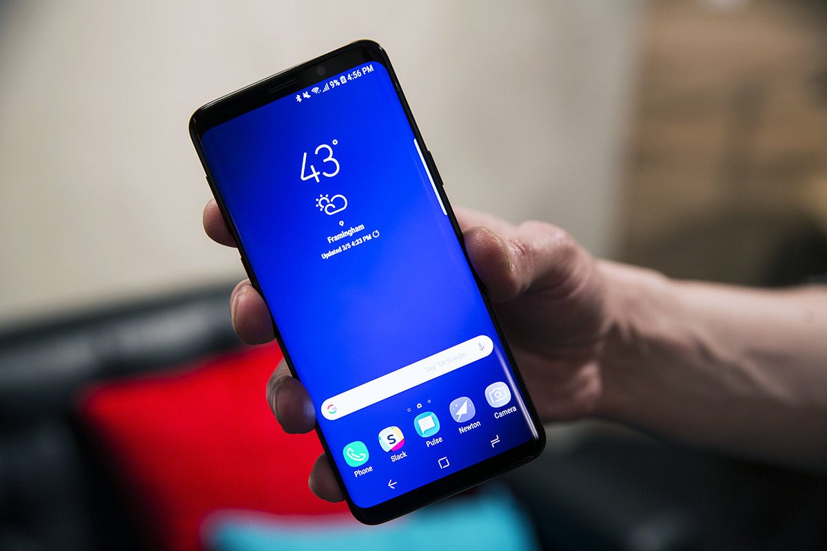
It might look the same, but the Galaxy S9’s screen is a big improvement over the S8.
The Galaxy S9 is a touch shorter than the S8 due to an ever-so-slightly smaller bottom bezel that upsets the symmetry just enough to annoy my eyes. It’s also thicker and heavier than its predecessor for two reasons: The front glass is thicker (0.6T vs. 0.5T), and the aluminum on the sides has been strengthened (AL 7003 vs AL 6013). While these changes are imperceptible, they should bring more durability and drop protection—always a plus for a phone that’s nearly all glass.
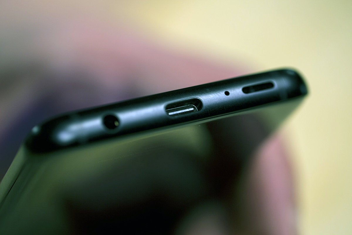
You’ll still find the selfie camera and other sensors around the receiver along the top strip of bezel, but they’re not as distracting as they were on the S8. Among the other small changes to the S9 are the look of the speaker grille on the bottom edge, which is now a 1.5mm open slit rather than five small openings. This change brings stereo sound, but could conceivably attract more dust and lint. Otherwise, the buttons and ports are exactly the same, meaning Samsung has once again resisted the trend to remove the 3.5mm headphone jack.
 Christopher Hebert/IDG
The Galaxy S9 has both a headphone jack and stereo speakers.
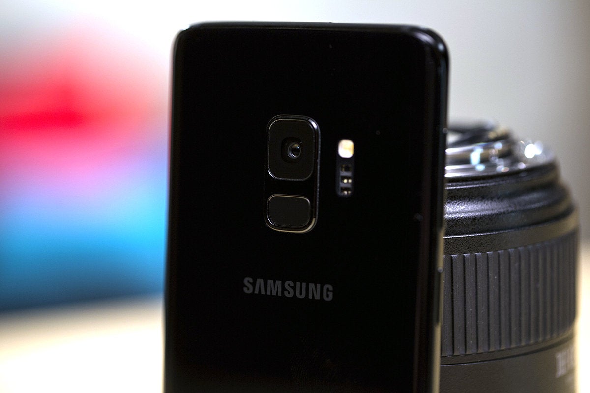
Flip it over and you’ll see the biggest design change between the S9 and S8: the location of the fingerprint sensor. Instead of putting it to the right of the camera lens, a position that was nearly impossible to reach without smudging the camera, Samsung has moved the sensor to the space directly below the camera. The border around it provides a slight tactile clue that you’re touching the sensor, but at just 0.5 millimeters away from the camera, it’s still too close in size and shape for my fingers. Overall, it’s a definite improvement in reachability, but still stubbornly flawed.
The Galaxy S9 sports the same 5.8-inch, 18.5:9 Infinity Display introduced with the S8. While the resolutions match up (2,960×1,440, 529ppi), the overall viewing experience has improved with the S9.
For one, the display is brighter. Its max of more than 1,100 nits pushes it into Note 8 territory and provides better visibility in direct sunlight. Colors are more vivid without being over-saturated or inaccurate, and the noticeable banding that we saw in gradients on the S8 is all but gone. All said, it’s the best screen (OLED or otherwise) I’ve seen on any Android phone, and it can proudly stand shoulder-to-shoulder with the iPhone X.
A fully baked and better version of Bixby
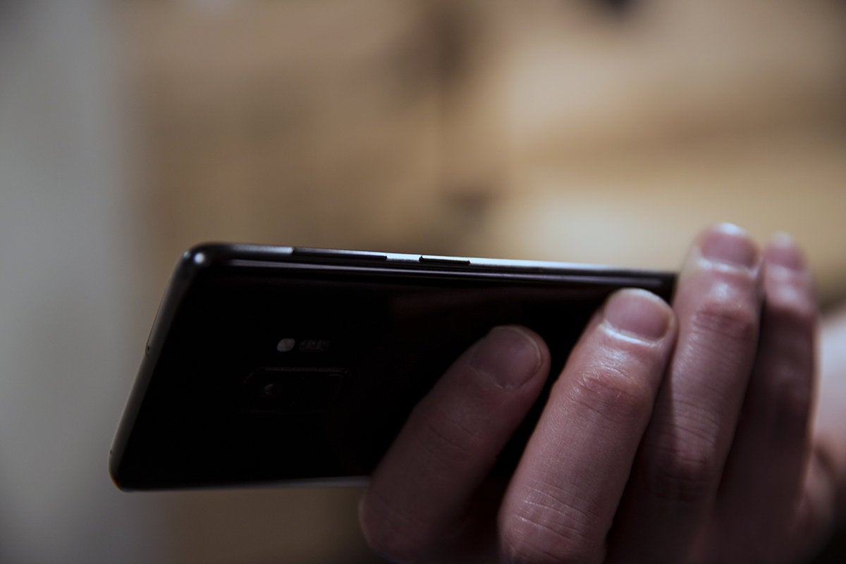
When you start up your Galaxy S9 for the first time, you’ll immediately be welcomed with a greeting from Bixby, a sure sign that Samsung is all-in on its AI assistant. Bixby is certainly more fleshed-out on the S9 than it was when the S8 launched, but it’s still not worthy of its own dedicated button, especially not one that’s in a position to be accidentally pressed a dozen times a day.
 Christopher Hebert/IDG
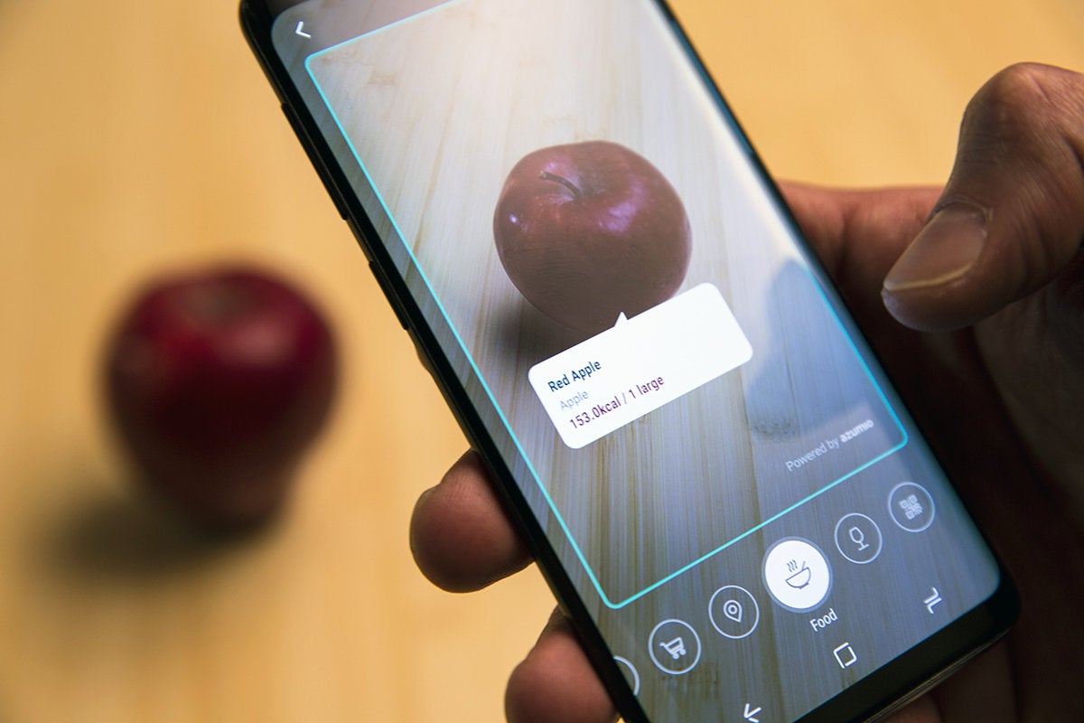
An apple a day keeps the Google Assistant away.
It’s not just the existence of the button that bothers me, it’s what it does. I don’t have an issue with the long-press-to-summon-Bixby functionality, but pressing it to open Bixby Home is completely useless. It’s essentially a lamer version of the Google Pixel’s personalized feed, and there’s little reason to visit it on a regular basis, let alone have a shortcut dedicated to it.
That Samsung months ago added a toggle to disable the Bixby button on the S8 (and it’s here on the S9 as well) is a testament to how little people use it. I have to wonder why Samsung didn’t offer an option on the S9 to launch Bixby Vision with the button instead (especially because the icon is visible only in Auto mode in the Camera app, and not so easy to find).
Once you do locate it, Bixby Vision on the S9 is vastly improved over the S8’s version, with real-time translation, and image scanning that’s both quicker and more accurate. It’s a bit more like the Assistant-powered version of Google Lens, scanning objects rather than needing to snap a pic first. The coolest new feature is food scanning, which taps into Azumio’s database to provide basic nutritional info. However, that process is hit-or-miss. It initially thought a banana was a plantain (close enough, I guess), and mistook an avocado for a kabocha squash. But, overall, it’s a neat addition to Bixby’s toolbox.
 Christopher Hebert/IDG
Bixby is much better on the S9, but it still doesn’t need its own button.
Bixby can also do translation without needing to snap a picture or clumsily highlight specific words. When it recognized the words, it worked fast and accurately (thanks to an assist from Google Translate), but like Bixby of old, it struggled with long strings of text.
Elsewhere, Bixby is essentially the same. The voice recognition works pretty much as it does on the S8 (which is to say, surprisingly well), and its best use is still as a “do things” assistant rather than as a “know things” assistant. Bixby is definitely improving and Samsung clearly has a vision for it, but we’ll have to wait until version 2.0 of Bixby Voice to see where the roadmap leads.
Expected performance and battery gains
A Galaxy S phone is once again the launching pad for Qualcomm’s latest processor—this time, the Snapdragon 845—and it’s mostly an incremental improvement over the 835. Here are some benchmark scores (higher numbers are better):
GeekBench (Single-core/Multi-core)
Galaxy S8: 1848/6193 Galaxy S9: 2392/8219
PCMark Work 2.0
Galaxy S8: 6784 Galaxy S9: 7610
3D Mark Sling Shot Extreme
Galaxy S8: 3378 Galaxy S9: 4551
 Christopher Hebert/IDG
The S9 has the same battery as its predecessor, but it squeezes more juice out of it.
While we see across-the-board improvements, the 845’s biggest gains are in graphics and power consumption. But even there, they’re not huge increases over the previous generation. Regardless, the S9 married to the Samsung Experience OS provides excellent battery life, with benchmark results consistently at or around 8 hours. That’s not as high as the nine-plus I got with the S8, but real-world use showed the S9 besting most recently released phones with bigger batteries—this despite using the same relatively small 3,000mAh battery that’s in the Galaxy S8. The S9 will almost certainly last you though a full day and maybe even part of a second, depending on use, but if you’re looking for a huge breakthrough in battery life, you’ll have to wait a little longer.
A fresh-out-of-the-box S9 will feel like the fastest phone you’ve ever used, especially if you’re upgrading from an S7 or S6. However, only time till tell whether the S9 and the Snapdragon 845 will stay speedy and optimized after six months or a year of use. That’s the biggest hurdle that Samsung has yet to overcome: keeping a phone feeling fresh on the inside after it shows signs of wear on the outside.
A great camera even without a second lens
The Galaxy S9 doesn’t come with the same camera technology as its S9+ big sibling, and that’s a bummer. Specifically, on the rear of the phone, the S9+ has the 12MP, dual-aperture “wide angle” camera Samsung is making a big deal about, along with a 12MP “telephoto” lens with a f/2.4 fixed aperture. Used in tandem, this dual camera set-up enables the Live Focus feature introduced in the Note 8.
The smaller S9, meanwhile, has only the dual-aperture camera. The results are still great in regular photos, but I miss having a slider to adjust the amount of blur that’s applied to a photo’s background when Live Focus is enabled.
Apple pulls the same shenanigans with the iPhone 8 and 8 Plus, essentially punishing people who want a smaller phone instead of an oversized one. Thankfully, though, the new dual-aperture “wide angle” camera is the main attraction, and it’s available on both models.
 Christopher Hebert/IDG
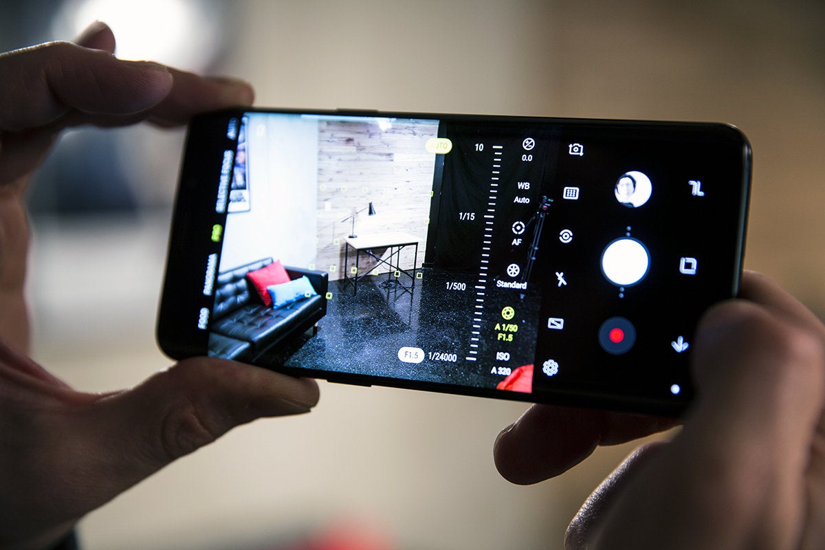
Samsung’s camera app lets you switch between f/1.5 and f/2.4 aperture on the S9 and S9+.
This camera comes with the same 1.4-micron pixels and optical image stabilization that Samsung introduced in the Galaxy S8, but the nifty Dual Aperture feature is all new, and lets you switch from f/2.4 to f/1.5 at the tap of a button. A mechanical element widens the aperture to f/1.5, and when the camera is in auto mode, the switch happens automatically if environmental lighting drops below 100 lux. That’s pretty amazing for a smartphone, and f/1.5 sets a new record for smartphone apertures, but in practice Dual Aperture isn’t as useful as you might think.
 Michael Simon/IDG
Here you can see the best-case scenario when using the S9’s f/2.4 aperture (bottom). The f/1.5 image at the top is obviously brighter, but the f/2.4 aperture in the bottom image gave greater definition to the ice-color rocks, the bubbles, and the penguin itself.
Because other smartphones always shoot in their widest possible aperture—i.e., their single, fixed aperture—Dual Aperture doesn’t actually offer any low-light benefits (other than what you get from an f/1.5 aperture naturally). But where the f/2.4 aperture should help is in regular lighting conditions: The camera can let in less light to (theoretically) accentuate shadows or gain a bit of clarity.
 Michael Simon/IDG
In certain circumstances, switching from f/1.5 (left) to the narrower f/2.4 aperture (right) yields clearer images with finer detail.
In very specific circumstances, you can definitely see the benefits of the higher aperture setting, but it’s probably not a setting you’re going to spend a lot of time using. For example, in the above images, switching to the f/2.4 aperture accentuated the texture of the coral in the penguin exhibit, as well as the edges of the jellyfish. But in most photos I took, it was hard to discern much of a difference. That being said, watching the lens switch between the two apertures is kind of mesmerizing.
 Michael Simon/IDG
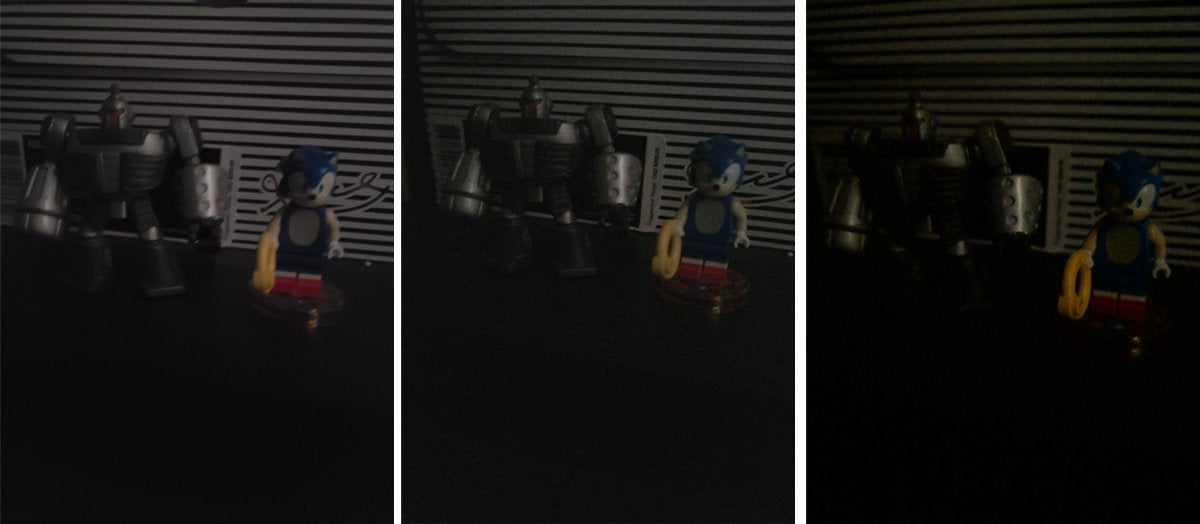
In extreme low light, the Galaxy S9’s f/1.5 aperture (left) captured images that are brighter and clearer than the S8+ (center) and Pixel 2 XL (right) achieved.
Like Dual Aperture, the S9’s 960-fps Super Slow-mo feature also left me wanting more. Switch to the new recording mode, and you’ll be able to slow down your videos to a ridiculous speed just by tapping the screen. The camera will even begin recording in slow-motion automatically, as soon as it detects motion in your frame. But while it’s a genuinely amazing feature to have on a smartphone (with appropriate credit going to the Sony Xperia XZ Premium for doing it first), there are some technical limitations.
First, Super Slow-mo records only in 720p, so videos can lack sharpness. Second, due to onboard memory limitations, you can capture only two-tenths of a second of real-time content, which is then spread out over six seconds of Super Slow-mo playback. The results are incredibly cool, but like Dual Aperture, it’s probably not a feature you’re going to spend a lot of time using.
During testing, I was most impressed with how the S9 captured objects in motion. Photos shot with the S8 can be soft or even blurry when locking in on movement, but I consistently captured crisp, clear pictures with the S9 whether my subject was still or moving. My S9 photos rivaled those on the Pixel 2 (in all kinds of light), and were noticeably better than the ones I took on the S8 as well.
Apple’s Animoji has a competitor in AR Emoji
Ever since Apple unveiled Animoji on iPhone X, it was just a matter of time until Samsung developed some kind of a response. Right on cue, the S9 delivers a feature called AR Emoji, which is at the same time better and worse than Apple’s version.
 Christopher Hebert/IDG
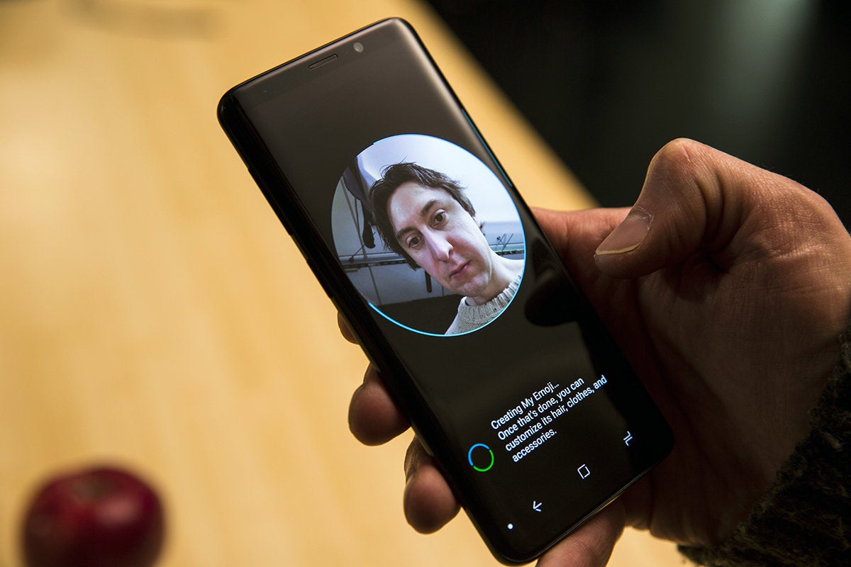
Creating a new AR Emoji emoji is a bit like Face ID on iPhone X.
While you can’t control actual Unicode-style emoji, Samsung does provide a handful of cartoon characters to control (though not quite as many as Apple), and Mickey Mouse and other Disney characters will be arriving soon to Samsung’s platform. But Samsung’s big innovation with AR Emoji is letting users create their own animated emoji based on their image and likeness. The creation process is somewhat similar to setting up Face ID on iPhone X, except you’ll need to snap a selfie on the S9 before it can work its magic.
 IDG
IDG
My AR Emoji isn’t exactly a spitting image, but it’s definitely me.
AR Emoji’s avatar engine only mimics faces, so you’ll need to fix your hair and add glasses if you wear them (AR Emoji suggests you remove glasses before starting the process). Otherwise, Samsung’s engine does a decent job of capturing enough unique facial features to create a fairly faithful avatar.
Once you create your AR Emoji, you can share stickers and make videos, and it’s here where the S9 stumbles a bit. Without a 3D camera like Apple’s TrueDepth sensor, tracking facial expressions isn’t nearly as good as it is on iPhone X, and both faces and characters have a flatter overall feel to them. Edges have sharp lines and movements are janky at times, but it’s still just as fun as it is on iPhone X.
Oreo brings some sweet new features
The Galaxy S9 brings Oreo to the Samsung Experience, so you’ll be able to enjoy many of the key features Google introduced with Android 8, including notification categories, app icon shortcuts, and better badge handling. However, it’s not as up-to-date as it could be. For example, because it’s not based on the latest 8.1 version, you don’t get the handy battery indicator for Bluetooth devices in Quick Settings. Hopefully that’ll come in a later update.
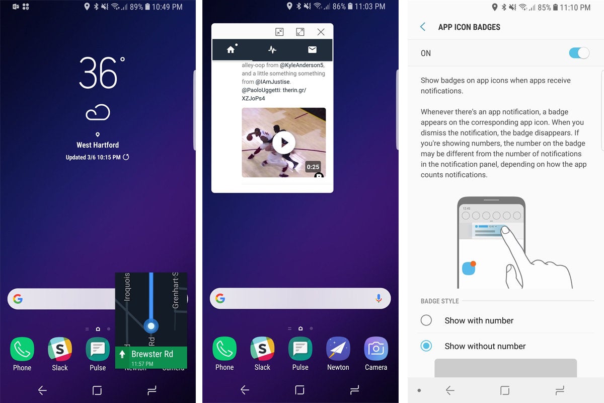
You will, however, get picture-in-picture here, enhancing a feature that has been on Samsung phones since the S7. While you can still swipe from the top left corner of the screen to create Pop-Up windows for any app, Samsung also utilizes Oreo’s automatic method for things like active Maps windows and videos playing in Chrome. It’s a good combination, making the S9 an even better multitasker than the Pixel 2. Also cool is the ability to use the home screen and app drawer in landscape mode.
 IDG
IDG
Oreo’s Picture-in-Picture works well with the S9’s Pop-Up View (center). And the S9 tweaks Android 8’s notification dots (right) to make them even more useful.
Oreo’s dots are here too, but there are a few differences. You can opt to show badges with or without numbers, which is a nice touch, but because dots and badges are tied to status bar notifications now, the indicators might not be as accurate as they could be. Samsung is also supporting Project Treble now, which will bring speedier upgrades to the S9. That means we shouldn’t have to wait six months to get Android P on the S9.
Samsung has introduced a new unlocking method that combines iris and facial recognition to create a super biometric called Intelligent Scan. It’s much better than either method on its own, but it’s no Face ID. It’s also less secure than iris on its own, and it still struggles somewhat in dark rooms and bright sunlight. I often had to adjust my positioning before it would let me in (though not as dramatically as with the iris scan on the S8). My biggest issue isn’t with the biometric itself, but rather how Samsung implements it. Because you can’t raise-to-wake the display or double-tap outside of the virtual home button, getting to Intelligent Scan isn’t as smooth as getting to Face ID on iPhone X, making the whole thing seem less smart than it ought to.
Should you buy a Galaxy S9?
Anyone who’s in the market for a new phone should seriously consider buying an S9. It might be an insignificant upgrade in terms of physical design, but that’s a concern only if you really, really want people to know you have the latest and greatest phone. Plus, the Galaxy S8 has an awesome design, so with the S9 you’re getting more of the same.
 Christopher Hebert/IDG
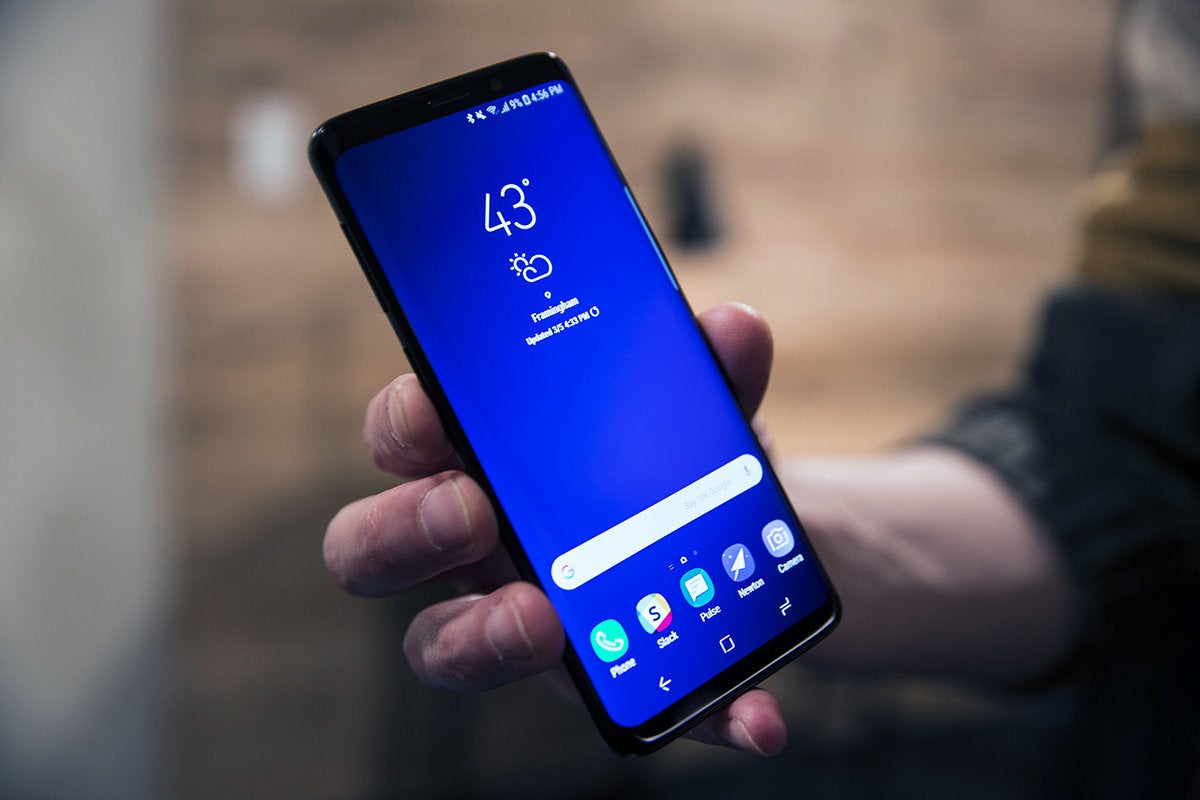
The Galaxy S9 looks a lot like the S8, but you shouldn’t judge this book by its cover.
While you’ll likely find a better deal on a Galaxy S8 (at least until the stock is depleted), you’ll be better served by spending an extra $100 or so on the new S9 model. The processor, camera, and design are all best-in-class, and because the S9 is actually $5 cheaper than the S8 was when it launched ($720 vs $725), you can buy confidently, knowing Samsung isn’t doing any price-gouging.
The Galaxy S9 isn’t a gotta-see-it or gotta-have-it phone like the S8 or iPhone X, but it’s a fantastic update to what was already one of the best handsets I ever used. The lack of a dual camera on the S9 is a bummer for sure, but the single camera is still an excellent performer (even if we don’t see amazing benefits from Dual Aperture). The lower price and smaller size will be worthwhile trade-offs for many buyers.
So don’t let the too-familiar design sway you away from the S9. Even if the S10 flips the script with a folding display, the S9 will be a great phone for years to come, and there’s little reason to fear that it will feel outdated or obsolete in a year’s time. Simply put, there’s a lot to like with the S9 even if doesn’t look as “new” as it could.